Pantone 2019 Color of the Year: Living Coral

By
Bill Schaffer, AIFD, AAF, PFCI, and Kristine Kratt, AIFD, PFCI
PostedJanuary 8, 2019
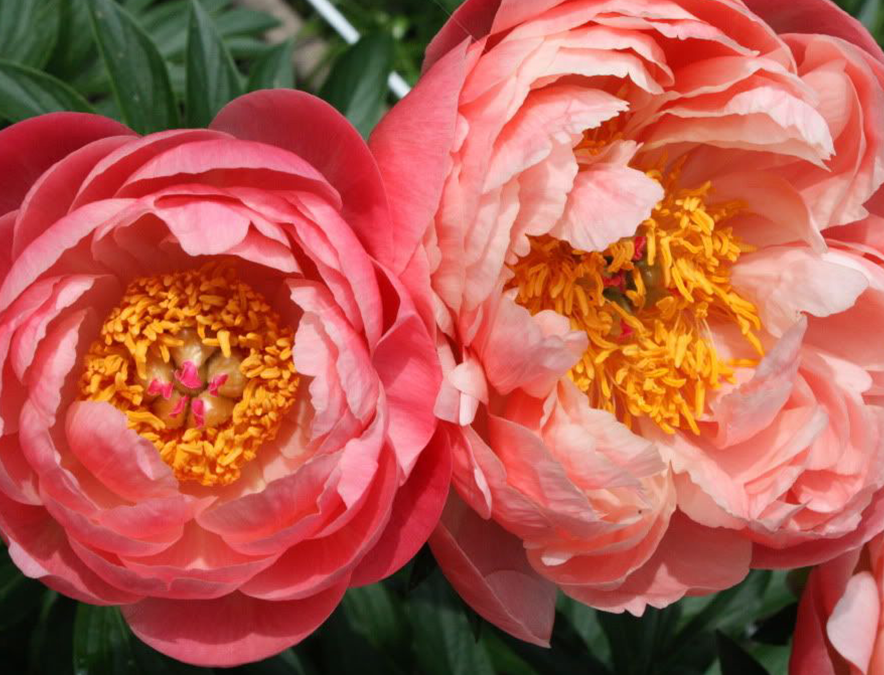
What is Pantone 16-1546 Living Coral? As a color, it’s described as “an animating and life-affirming shade of orange with a golden undertone.”
Living Coral is a “life-affirming coral hue [that] energizes and enlivens with a softer edge.” Pantone’s press release describes it as embodying “warmth and nourishment,” offering “comfort and buoyancy in our continually shifting environment.” The Color of the Year is “sociable and spirited,” it “inspires experimentation and playful expression” while giving “comfort and positivity in simple color stories.”
Living Coral is “explorative and effervescent.” It is a “life-affirming hue that complements all skin tones.” It is “humanizing and heartening” with opportunities for “experiences that enable human interaction and social connection.”
WOW! Reading these descriptive phrases must make Living Coral the evolutionary pinnacle of all past colors-of-the-year, putting an end to all future colors-of-the-year. No, not really. It is the result of countless hours of research that Pantone does to gather, collate, analyze and define real-world shifts in color. It’s how these conclusions affect social media, fashion, beauty, product development, home décor, package design and, yes, even floral.
“Warm and welcoming, this life-affirming shade invites us to reach out and touch.” In today’s world of tactile deprivation, flowers are the natural way for people to connect with nature. Touch is one of the primary reasons people gravitate to flowers, but it is color that catches their eyes. Occasion, price and variety of flower are all reasons that people make their selections, but if given multiple choices in the same price and the same type of flower, it will be color that influences the final decision.
As a new trend color begins to take root in the global consumer conscious, awareness of that color will become heightened, and purchase demand will increase for this “new look.” At times, these trends are seen coming for months and years in advance, but sometimes they are tricky and sneak up on us.
Cut flower growers plan their crop cycles years in advance and often do not have enough of the new trend colors in the ground. If the color of the year for 2019 was announced to the world of fresh flowers at the beginning of 2018, flower farms might have had the opportunity to adjust their planting schedules – that is, if they had enough seed crop to plant coral-colored flowers. This doesn’t mean it’s too late to quickly capitalize on this “natural, yet dynamic and energizing” color.
In the world of flowers, it’s merchandizing and packaging that can make an immediate difference. The fastest way to launch a new trend color into your retail floral environment can be through wraps, paper, ribbons and accessories that can connect a newly announced trend color to your existing line. Merchandizing with coral-based accents, containers and signage can attract customers to this happy color. It can be as simple as adding a pick to the flower bouquet that will connect a powerful marketing tool such as Pantone’s Living Coral to your social media and trend-savvy consumers.

Bill Schaffer, AIFD, AAF, PFCI, and Kristine Kratt, AIFD, PFCI, are the creative directors of Schaffer Designs. Bill is a third-generation floral designer from Philadelphia, and Kristine grew up in the floral industry of Northern California. They specialize in event design, education, product development, and showroom and trade-show design. They are recognized experts in U.S. floral color and trend marketing. Bill and Kristine are cutting-edge creators of “floral-sharing” opportunities through their award-winning “Best in Show” exhibits at the Philadelphia Flower Show and numerous commissioned floral art installations. They are authors of Taking the Flower Show Home. Visit their website at schafferdesigns.com.